OverView
Hope City Church’s Retreat was brought to life with a visual identity centered on the theme of Revival. The project included a logo featuring fire and sun rays, along with a carefully designed pamphlet that clearly presented the schedule and retreat details.
The Challenge
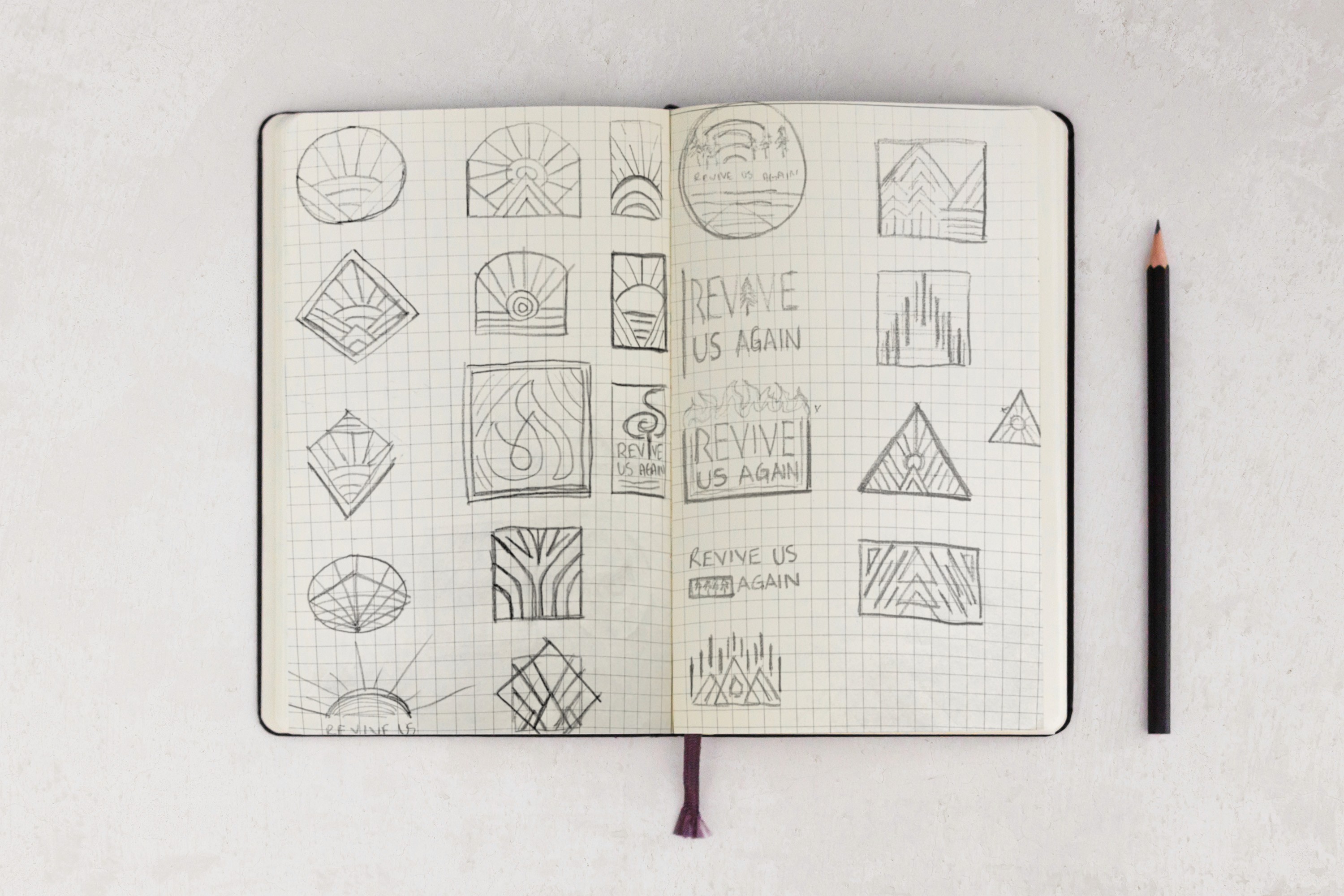
Creating a timeless and versatile emblem for the retreat posed a unique challenge. The design drew inspiration from stained glass, fire, mountains, and the sun, exploring geometric forms that could translate seamlessly onto a crewneck while capturing the spirit of the event. The creative process involved sketching as many ideas as possible in this geometric, timeless style.

The Solution
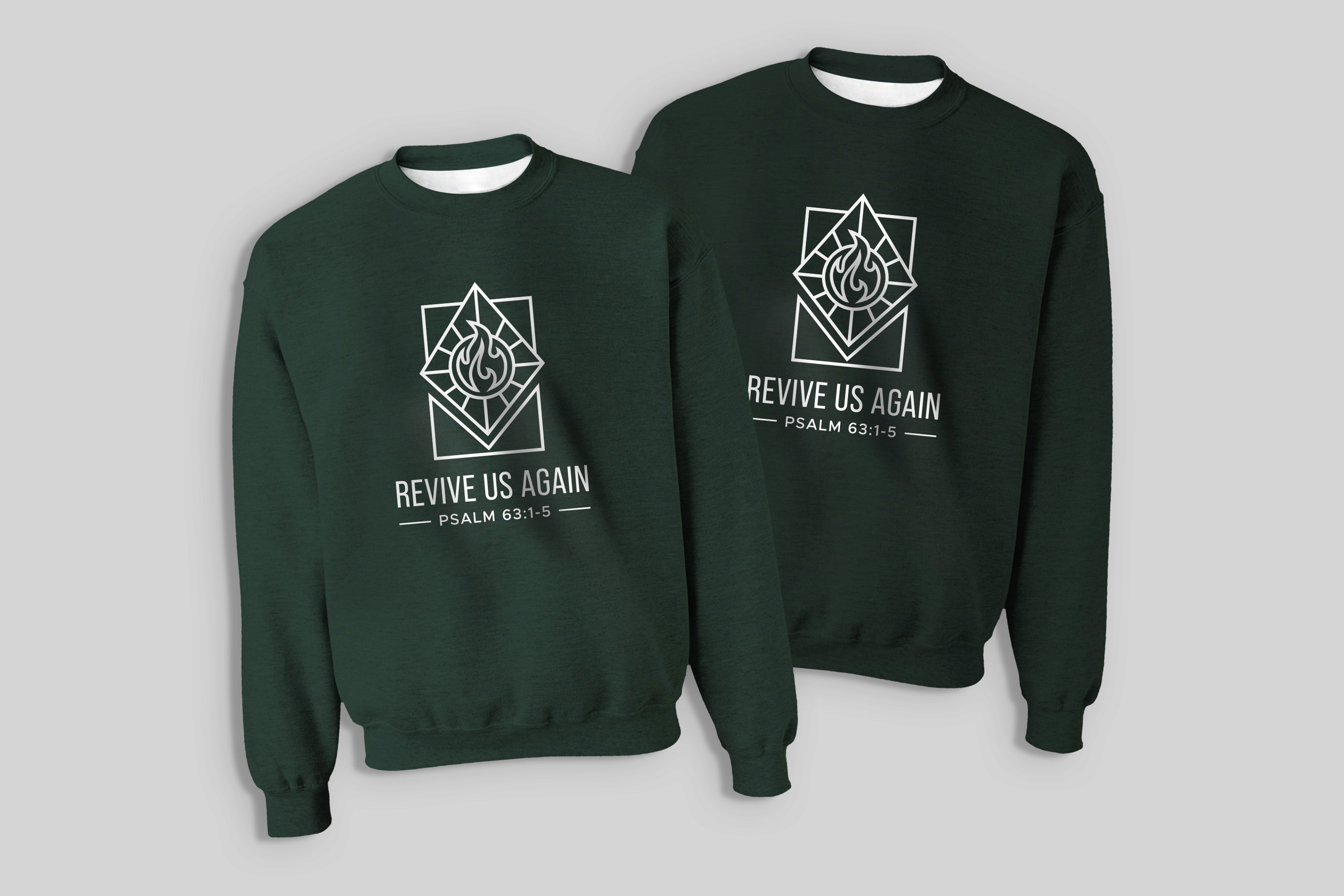
The solution brought the theme of Revival to life by combining sun rays and fire into a single emblem. The design was tested on crewnecks to refine the look, alongside color explorations. Building on Hope City’s original light green, a deeper forest green and cream palette—or an ocean blue inspired by the Chilliwack retreat location—was introduced to create a cohesive and elevated visual identity.

The Result
The finalized logo places a flame at the center of a sun, framed within a diamond shape to symbolize the passion and revival at the heart of the retreat. Set alongside a tall, narrow sans serif font, the emblem clearly communicates the theme and significance of the event. Printed on crewnecks and t-shirts, the design complemented the retreat’s surroundings, while also extending across presentation slides, QR codes, and announcements. The accompanying pamphlet featured a custom, color-coded schedule and a redesigned map, providing a clear and accessible resource for attendees while reinforcing the retreat’s cohesive visual identity.