
OverView
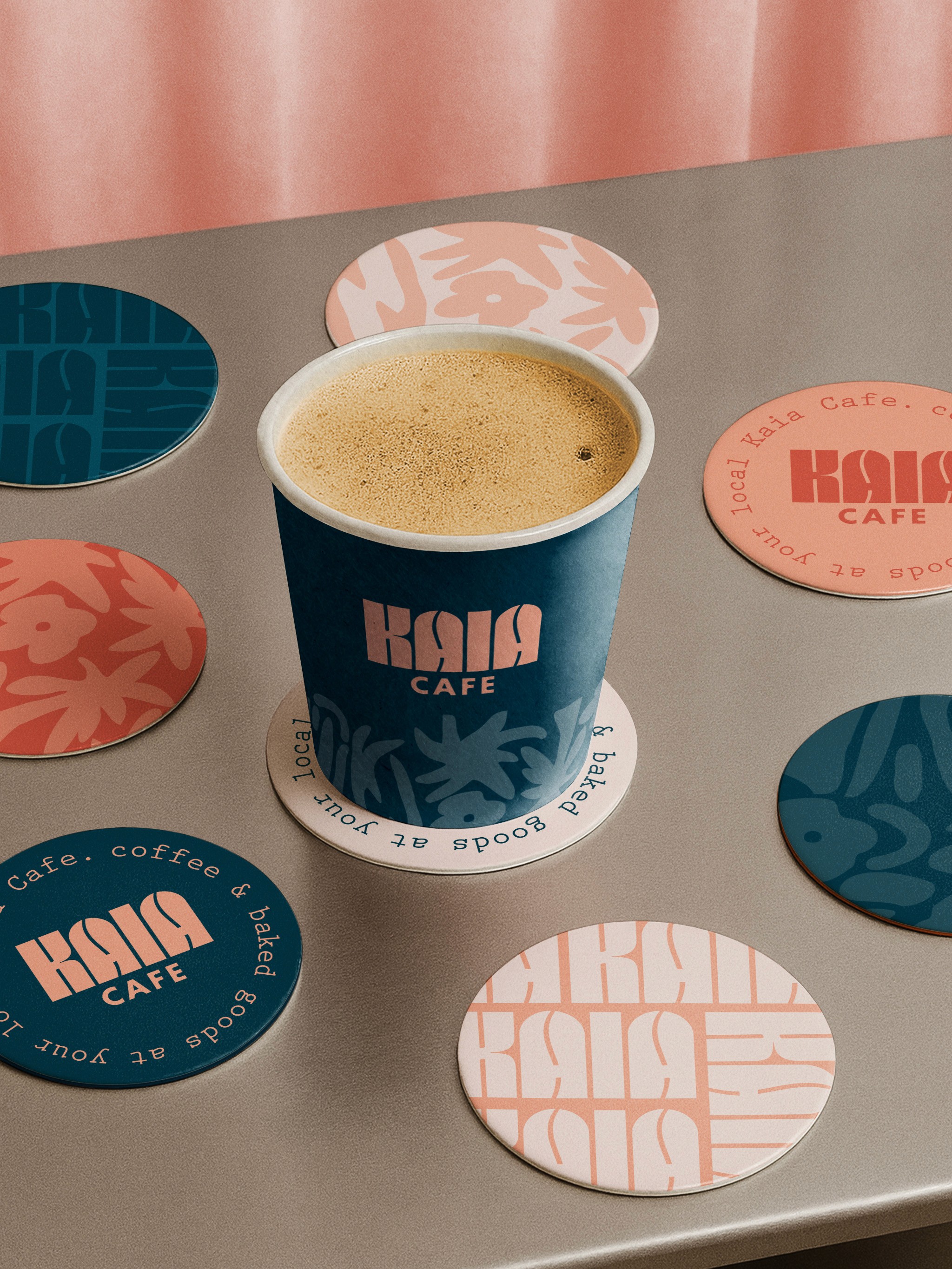
Inspired by the meaning of Kaia—“sea” in Hawaiian—the brand explores a modern interpretation of island life through color, form, and texture. Designed for a high-traffic airport environment, the identity balances approachability with strong visual impact, creating a memorable and inviting coffee experience for travelers. The visual system combines bold, contemporary typography with abstract, organic patterns that subtly reference the surrounding landscape. Rather than relying on literal motifs, the design captures the feeling of the coast—fluid, warm, and relaxed—while maintaining a clean, design-forward aesthetic.
The Challenge
The primary challenge was to create a visually compelling brand that could stand out in a busy airport setting while still feeling refined and cohesive. The identity needed to attract attention quickly, draw customers in, and communicate a distinct sense of place without leaning into clichés. Another key consideration was developing a pattern language that paid homage to Hawaiian culture and environment in a respectful and abstract way—avoiding overly literal or expected tropical visuals, while still evoking the spirit of the islands.

The Solution
The solution was to build a bold yet approachable identity system anchored by a vibrant, coastal-inspired color palette. Warm coral tones were used to reflect aquatic life and island warmth, contrasted with a deep ocean blue to ground the system and evoke the surrounding sea. A custom typographic approach was developed for the logo, featuring strong, geometric letterforms with subtle coffee bean-inspired shapes embedded within, adding a layer of visual interest and brand storytelling. Abstract, organic patterns were introduced across applications to create movement and variation, reinforcing the coastal narrative without relying on literal imagery. These elements were applied consistently across packaging and signage to create a cohesive and scalable brand presence.

The Result
The final identity is a distinctive and flexible brand system that feels both place-driven and contemporary. It stands out within a fast-paced airport environment while maintaining a sense of ease and warmth. Through its thoughtful use of color, typography, and pattern, Kaia Café creates a memorable visual experience that invites travelers to pause, recharge, and connect with a subtle sense of the coast—transforming a quick coffee stop into a moment of calm within the journey.


