Custom Illustrated Branding
Client
Divine Property Group
Industry
Real Estate
Service
Branding
Branding Guidelines
Duration
1 Month
OverView
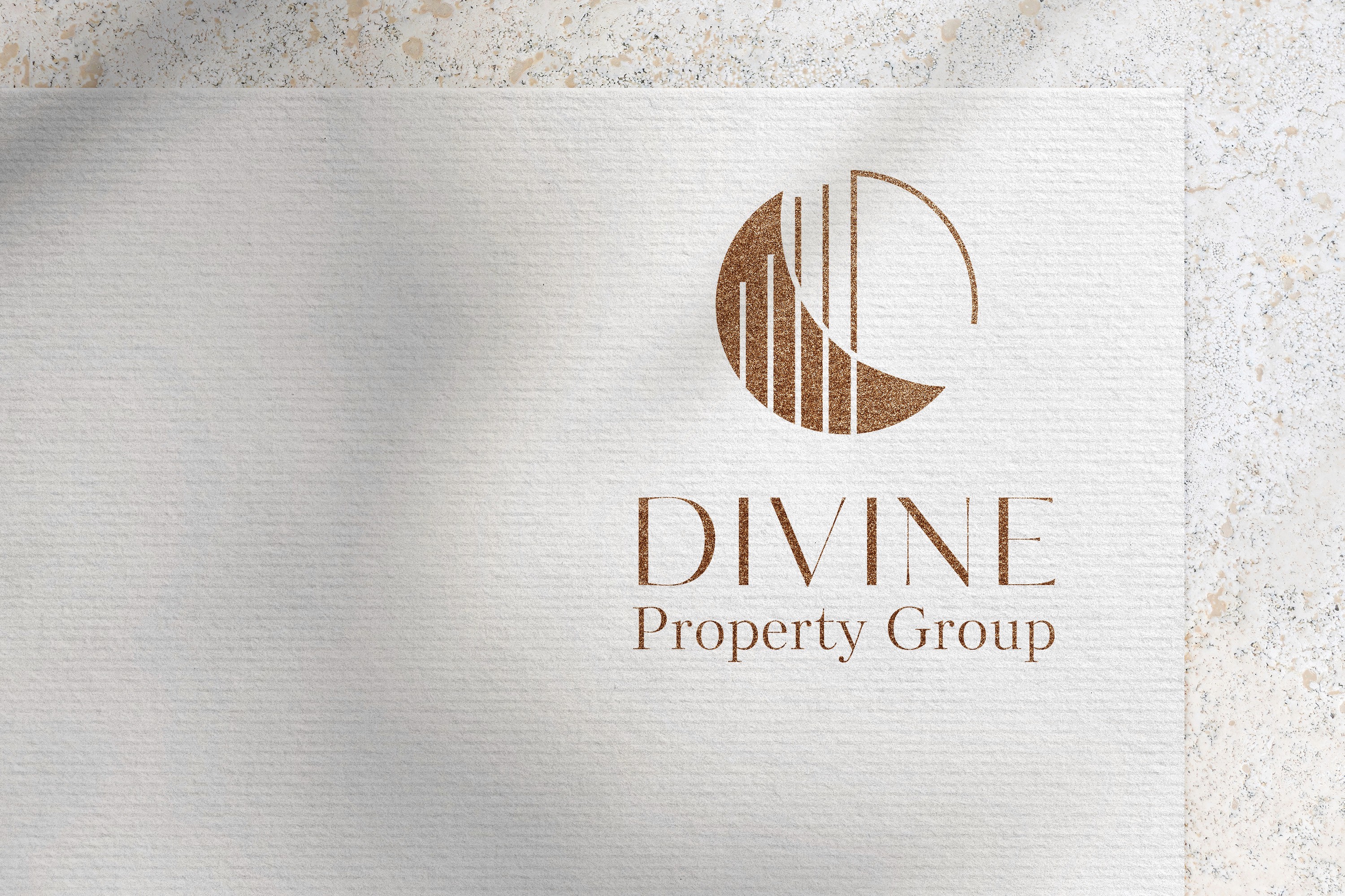
As a new team establishing their presence in the competitive Victoria market, Divine Property Group required a cohesive brand that felt refined yet approachable. The creative direction focused on crafting a geometric emblem with subtle moon-inspired forms, symbolizing growth, stability, and success. Complementary typography and a neutral, warm palette were developed to communicate trust and sophistication across all touchpoints.

The Challenge
Creating a unified identity that represented both realtors’ visions while appealing to a high-end market required thoughtful balance. The design needed to feel timeless and professional, without leaning too heavily into celestial or mystical motifs, and adaptable across both digital and print platforms.

The Solution
The brand exploration began with hand-drawn concepts inspired by geometric interpretations of the moon. After refining and vectorizing the top designs, several emblem variations were presented in context using photography and mockups. A warm neutral palette paired with modern serif and sans-serif typography completed the identity, reinforcing a sense of sophistication and approachability.

The Result
The final emblem harmonizes both partners’ creative visions—a geometric moon form with linear shapes radiating outward, symbolizing growth and forward momentum. The result is a timeless and elegant brand identity that embodies Divine Property Group’s professionalism, partnership, and dedication to their clients.